NYC Building Materials is a dynamic mapping platform that leverages public data, machine learning, and advanced data visualization to map the building materials of New York City. By using these materials as a lens, it explores what exists, what is being lost, and what should be built in the city's future.
NYC Building Materials is developed by Hao Lee for the Computational Design Practices program at GSAPP Columbia.
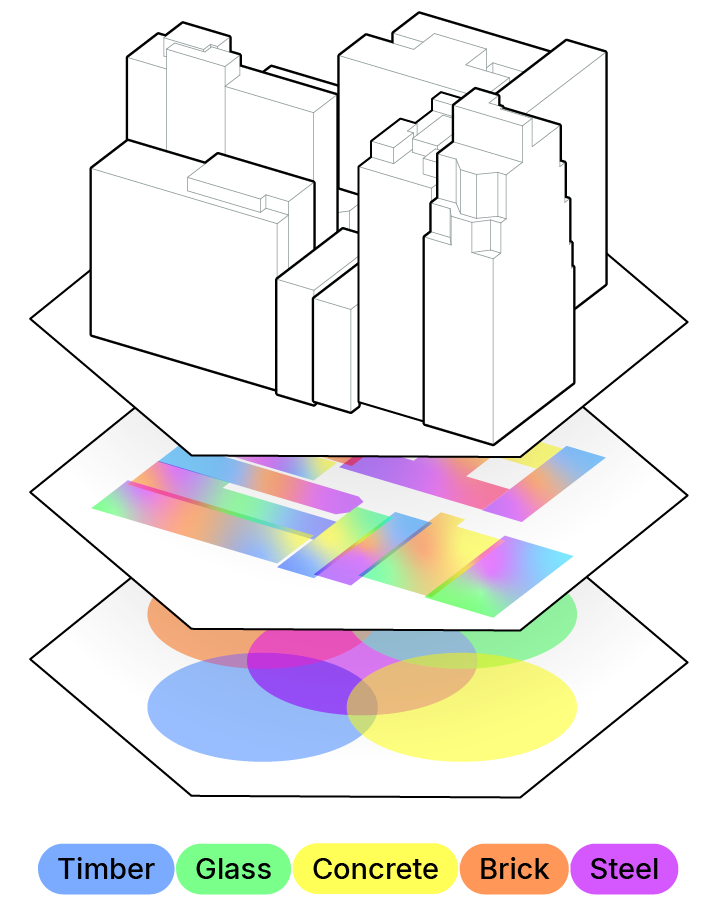
By overlaying five distinct colors, we can uncover hidden urban patterns throughout NYC. Each hue and stroke on the map reflects a unique historical context and design logic that shaped the city’s built environment. Here are a few patterns to look out for!


This project relies solely on open-source data for machine learning training and data visualization. No monetized data or subscription services were used in its development. For details on the machine learning data, refer to the full story in the "ABOUT" tab.
The Regional Assessment of buildings’ Material Intensities (RASMI)
by Tomer Fishman, Alessio Mastrucci, Yoav Peled, Shoshanna Saxe, Bas van Ruijven
NYC MapPLUTO data
by NYC Department of City Planning
Carbon Leadership Forum Material Baselines for North America (August 2023)
by Carbon Leadership Forum (CLF)
NYC Census data (2020)
by The National Historical Geographic Information System (NHGIS)
NYC Building Energy and Water Data Disclosure for Local Law 84 (2022-24)
by NYC Department of Buildings (DOB)
NYC Census Tracts (2020)
by NYC Department of City Planning
NYC Neighborhoods Map
originally uploaded by Sam Lerner Dreamer
Parks Properties
by NYC Department of Parks and Recreation (DPR)
New York State Civil Boundaries
by New York State GIS Resources
NJ Counties
by NJ Office of Information Technology, Office of gGis (NJOGIS)
NYC GIS Zoning Features
by The Department of City Planning (DCP)
NYC Subway Lines
by The Metropolitan Transportation Authority (MTA)
2019 LIRR Routes & Stops;
2019 Metro-North Routes & Stops; and
2017 PATH Train Routes & Stops
by The Texas GeoData Portal at UT Austin
Construction Demolition Registrants
by NYC OpenData
Geospatial Data for Bedrock Elevation and Overburden Thickness Maps of the Five Boroughs, New York City, New York
By Laura M. DeMott, Frederick Stumm, and Jason S. Finkelstein, in cooperation with the New York City Department of Design and Construction
New York City Bus Routes, December 2019
by GIS Lab, Newman Library, Baruch CUNY
DCM Arterials and Major Streets, March 2025
by NYC Department of City Planning
New York City bus stops
by New York Startup Index
 Turn off markers


